
Google Mobile SEO
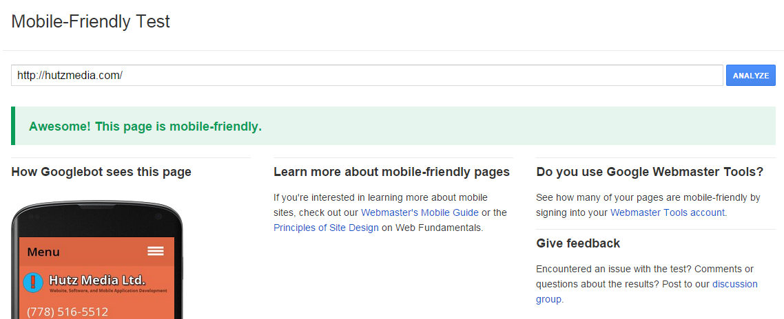
As of April 2015, Google has significantly changed the way that websites rank whether they have a mobile friendly website or not. Is your website mobile friendly?
This change only affects rankings for searches that originate from a mobile device. So if your website isn’t mobile friendly in the first place, why would you want to improve your SEO ranking from mobile searches?
The fact is that mobile use is growing every year. According to CBC, 49% of all time spent online is on a mobile device (source).
Ten years ago it was vital that your business simply had a website. Now it is paramount that your business has a website that works on every device especially mobile.
Responsive Web Design
A website needs to not only work on mobile devices, but also work on desktop computers and laptops. In the past, companies would build two versions of a website — one for mobile and one for desktop. Back then mobile devices had their own special markup and were very limited in what they could do. Now, mobile devices have full support for modern HTML standards so today you can build a website that works on all devices.
A responsive web design strategy will enable you to build a website that transforms automatically based on the current screen size. Typically columns are split up into rows, images change size automatically, and header menus get moved into a dropdown tab.
Hutz Media Ltd. offers responsive web design . If you need help getting your business’s web site mobile friendly contact us.
Until June 2015 you can get a $150 off on all new projects as well as free hosting for your app’s backend or website for one year. Contact us now for a consultation.

