
Responsive Web Design
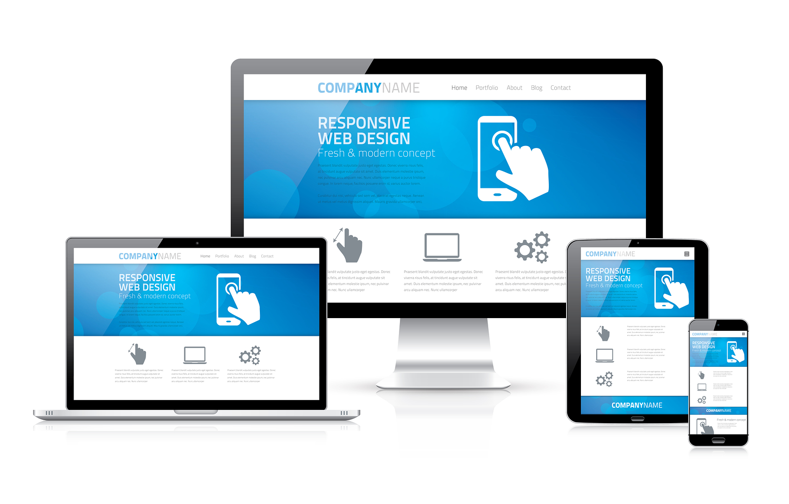
Responsive web design is an approach to web design that crafts site with an optimal viewing experience on all devices and screen sizes. That means easy reading and navigation with minimal resizing, panning, and scrolling.
In Canada 49% of all time spent online is spent on mobile devices. Each year this figure increases. It is import that your website and its user interface work well on a small screen. This website works on a small screen. Go ahead, if you’re on a desktop, resize the screen and watch how the menu and content shifts to adapt automatically.
When creating a responsive website it is important to plan accordingly. All of the page’s elements must be organized in a way that will scale correctly or move from a multiple column to a single column configuration.
The work gets done in the page’s CSS file. CSS, or Cascading Style Sheets, is a style sheet language used for describing the look and format of the page.
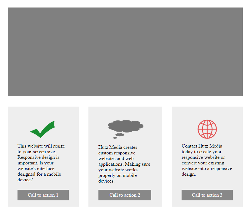
Response Website Example
Let’s say we have a standard page that has a banner and a feature list. We want the banner to stretch the full width of the window and the feature list to be split into three columns. On small screens we want the feature list to be split into three rows.
index.html
<!doctype html>
<html lang="en">
    <head>
        <meta charset="utf-8">
        <meta name="viewport" content="width=device-width, initial-scale=1">
        <title>Responsive Example</title>
        <link rel="stylesheet" type="text/css" href="responsive.css" >
    </head>
    <body>
        <section id="pageBanner">
            <img src="banner.png" alt="Banner">
        </section>
        <section id="featureList">
            <ul>
                <li class="col-1">
                    <img src="col-1.png" alt="col-1">
                    This website will resize to your screen size. Responsive design is important. Is your website's interface designed for a mobile device?
                    <a href="#">Call to action 1</a>
                </li>
                <li class="col-2">
                    <img src="col-2.png" alt="col-2">
                    Hutz Media creates custom responsive websites and web applications. Making sure your website works properly on mobile devices.
                    <a href="#">Call to action 2</a>
                </li>
                <li class="col-3">
                    <img src="col-3.png" alt="col-3">
                    Contact Hutz Media today to create your responsive website or convert your existing website into a responsive design.
                    <a href="#">Call to action 3</a>
                </li>
            </ul>
        </section>
    </body>
</html>
responsive.css
#pageBanner img {
    width: 96%;
    margin: 2%;
}

#featureList {
    display: block;
    overflow: auto;
    clear: both;
}

#featureList ul {
    list-style: none;
    margin: 0;
    padding: 0;
}

#featureList ul li {
    position: relative;
    float: left;
    width: 29%;
    margin: 2%;
    padding: 4%;
    box-sizing: border-box;
    background-color: #eee;
    min-height: 320px;
}

#featureList ul .col-2 {
    width: 30%;
}

#featureList ul li img {
    width: 100%;
}

#featureList ul li a {
    box-sizing: border-box;
    position: absolute;
    bottom: 6%;
    width: 72%;
    text-align: center;
    display: block;
    margin-top: 8px;
    text-decoration: none;
    color: #fff;
    background-color: #888;
    padding: 8px;
}
This example page will automatically scale to the size of the window. But what happens when we reduce the window to the size of a mobile device (480px)?
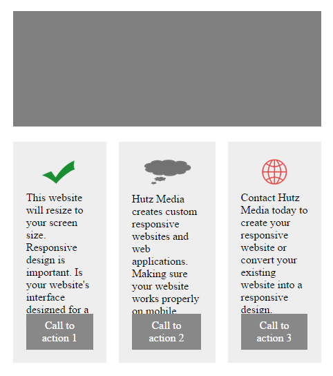
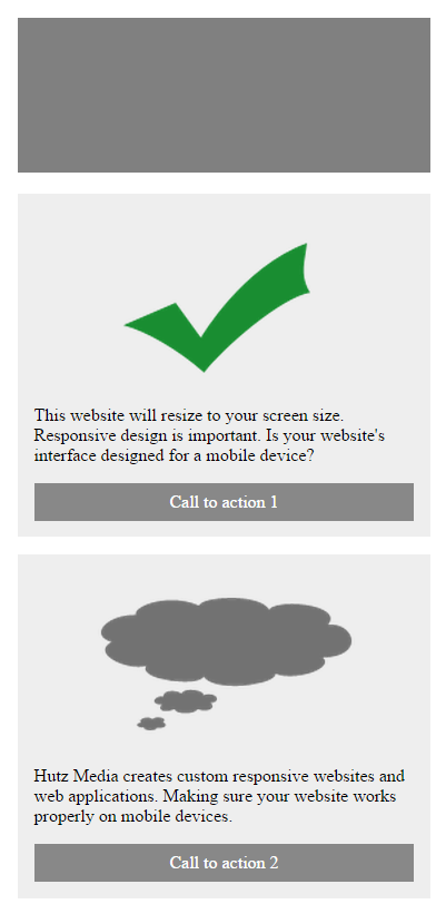
As you can set the text in the feature list is squished together and extends past the call to action buttons. We will now alter the CSS to target specific screen sizes. On mobile screens we will change the 3 columns to 3 rows.
responsive.css
/* Target mobile */
@media all and (max-width: 767px) {

    #featureList {
        width: 100%;
        padding: 2%;
    }

    #featureList ul li {
        padding: 4%;
        margin-bottom: 16px;
    }

    #featureList ul li a {
        margin-top: 16px;
    }

}
/* Target desktop */
@media all and (min-width: 768px) {

    #featureList ul li {
        float: left;
        width: 29%;
        margin: 2%;
        padding: 4%;
        min-height: 320px;
    }

    #featureList ul .col-2 {
        width: 30%;
    }

    #featureList ul li a {
        position: absolute;
        bottom: 8%;
        width: 72%;
    }

}

/* Target all */
#pageBanner img {
    width: 96%;
    margin: 2%;
}

#featureList {
    box-sizing: border-box;
    display: block;
    overflow: auto;
    clear: both;
}

#featureList ul {
    list-style: none;
    margin: 0;
    padding: 0;
}

#featureList ul li {
    position: relative;
    box-sizing: border-box;
    background-color: #eee;
}

#featureList ul li img {
    width: 100%;
}

#featureList ul li a {
    box-sizing: border-box;
    text-align: center;
    display: block;
    text-decoration: none;
    color: #fff;
    background-color: #888;
    padding: 8px;
}
The CSS now targets devices smaller than 768px and provides special rules to format the page accordingly.
Contact us now to get your responsive website created or an existing website converted to a responsive design.

